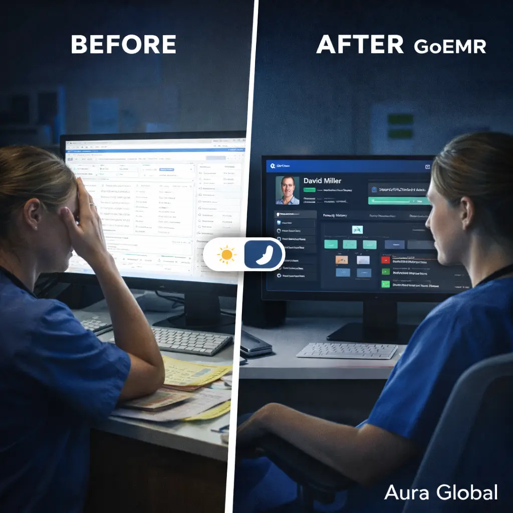
It's 3 AM on a 12-hour night shift. The ED is finally quiet — two patients sleeping, one waiting on labs. The nurse at the workstation squints at a blinding white screen, adjusting the monitor brightness for the fourth time tonight. The interface was designed for a well-lit office at 10 AM, not a dimmed department at 3 AM. Every click feels like staring into a flashlight.
This isn't a comfort issue. It's a clinical one. Eye fatigue leads to missed details. Missed details lead to errors. And in healthcare, errors have consequences that can't be undone. The screen that's supposed to help providers deliver care is actively working against them for half the day.
AuraEMR was built with a different assumption: that the people using it work around the clock, in every lighting condition, with varying visual abilities — and the software needs to work just as well for all of them.
The Bright Screen Problem
Most EMR systems were designed with one mode: bright. White backgrounds, gray text, tiny fonts, and interfaces that look like they were built for a spreadsheet, not a clinical environment. During the day, in a well-lit clinic, this is tolerable. But healthcare doesn't stop when the sun goes down.
The problems with bright-only interfaces compound over time:
- Eye strain during night shifts — Staring at a white screen in a dimmed environment causes eye fatigue, headaches, and difficulty focusing. Night shift workers report significantly higher rates of visual discomfort when using bright interfaces for extended periods.
- Disrupted circadian rhythm — Blue-rich white light from screens suppresses melatonin production. For night shift workers already fighting their body's natural clock, a glaring EMR screen makes the adjustment harder and the health consequences worse.
- Ambient light interference — In patient rooms at night, a bright monitor screen can disturb sleeping patients. Providers end up angling screens away, dimming brightness to unreadable levels, or avoiding the computer altogether — none of which is acceptable for clinical documentation.
- Reduced contrast perception — When your eyes adjust to a bright screen in a dark room, you lose contrast sensitivity. Switching between the screen and the dimly lit room means your eyes are constantly readjusting, which slows down everything.
A system that's only usable in perfect lighting isn't built for healthcare. It's built for a demo.
Dark Mode That Isn't an Afterthought
Most software that offers dark mode treats it as an inversion filter — take the white background, swap it to black, invert some colors, and call it done. The result is usually a mess: text that's hard to read, icons that disappear against dark backgrounds, charts with inverted colors that no longer make clinical sense, and UI elements that look like they were designed by accident.
AuraEMR's dark mode was designed from the ground up as a first-class experience, not a CSS filter applied on top of the light theme. Every element was considered independently:
- Purpose-built color palette — The dark mode doesn't just invert colors. It uses a carefully crafted palette with deep navy and charcoal backgrounds, teal accent colors, and text that's calibrated for readability against dark surfaces. Every color pairing was tested for contrast ratio compliance.
- Preserved visual hierarchy — In light mode, visual hierarchy is created through shadows, borders, and background shading. In dark mode, these cues need to be completely rethought. AuraEMR's dark theme uses subtle elevation, border luminance, and surface layering to maintain the same visual hierarchy without relying on the light-mode patterns that break in dark contexts.
- Clinical color integrity — Triage colors, alert indicators, and status badges retain their meaning in both modes. Red still means critical. Green still means normal. The colors are adjusted for visibility against dark backgrounds, but their clinical semantics never change.
- Charts and data visualization — Lab trend charts, vital signs graphs, and dashboards are rendered with dark-mode-specific palettes. Axis lines, data points, and legends are all optimized for dark backgrounds. No washed-out charts. No invisible grid lines.
- Smooth transition — Switching between light and dark mode doesn't trigger a jarring flash. The transition is instant but smooth, and your position in the interface stays exactly where it was. Toggle once and keep working.
The result is a dark mode that feels native — like the application was always meant to look this way. Because it was.
WCAG 2.1 AA Compliance — What It Actually Means
"WCAG compliant" gets thrown around a lot in software marketing. Most of the time, it means someone ran an automated scanner once and fixed the most obvious issues. Real accessibility compliance is far more demanding than that — and far more important.
The Web Content Accessibility Guidelines (WCAG) 2.1 at the AA level set specific, measurable standards for making software usable by people with disabilities. AuraEMR meets these standards across the entire application, in both light and dark mode:
- Color contrast ratios — Every text element in AuraEMR meets the WCAG minimum contrast ratio of 4.5:1 for normal text and 3:1 for large text. This applies to body text, labels, button text, form inputs, error messages, and navigation elements — in both themes. Low-contrast text isn't just hard to read; for users with low vision, it's invisible.
- No information conveyed by color alone — Triage levels, alert statuses, and form validation states all use secondary indicators alongside color. A critical alert isn't just red — it also has an icon, a label, and a distinct shape. A required field doesn't just have a red border — it has a text indicator. Users with color vision deficiency get the same information as everyone else.
- Text resizing without loss of function — AuraEMR's interface remains fully functional when text is resized up to 200%. Content reflows, navigation remains accessible, and no information is hidden behind a scroll overflow. Providers who need larger text don't have to choose between readability and functionality.
- Focus indicators — Every interactive element has a visible focus indicator. When a user tabs through the interface, they always know exactly where they are. The focus ring is visible in both light and dark mode with sufficient contrast against any background.
- Error identification — When a form field has an error, AuraEMR identifies the field, describes the error in text, and suggests how to fix it. Errors aren't just a red border — they're a clear message that any user can understand and act on.
Accessibility compliance isn't a line item on a feature list. It's a commitment to ensuring that every healthcare professional can use the tools they need to care for patients — regardless of their visual, motor, or cognitive abilities.
Accessible software isn't a nice-to-have. It's a requirement. Full stop.
Screen Reader Compatibility
Screen readers are assistive technology used by people who are blind or have severe visual impairments. They convert on-screen content into speech or Braille output, allowing users to navigate and interact with software entirely without vision. For a screen reader to work properly, the underlying application has to be built with semantic structure and ARIA (Accessible Rich Internet Applications) attributes.
Most EMR systems fail this completely. They're built with custom UI components that look right visually but communicate nothing to assistive technology. A button that looks like a button but isn't coded as one is invisible to a screen reader. A dropdown menu that opens on hover but has no keyboard binding is inaccessible. A data table with no header associations is meaningless when read aloud.
AuraEMR is built with screen reader compatibility as a foundational requirement:
- Semantic HTML throughout — Buttons are buttons. Links are links. Tables have headers. Forms have labels. Headings follow a logical hierarchy. The DOM structure reflects the visual structure, so screen readers can navigate the interface the same way a sighted user scans it.
- ARIA labels and descriptions — Every interactive element that isn't self-describing has an ARIA label. Icons with actions have text alternatives. Complex widgets like date pickers, autocomplete fields, and modal dialogs announce their purpose, state, and available actions.
- Live region announcements — When dynamic content changes — a new lab result arrives, an alert fires, a patient status updates — AuraEMR uses ARIA live regions to announce the change to screen readers without interrupting the user's current task. Critical alerts are announced immediately. Non-critical updates wait for a natural pause.
- Tested with real screen readers — AuraEMR is tested with NVDA, JAWS, and VoiceOver — the three most widely used screen readers. Not just "it doesn't crash," but "a screen reader user can complete every clinical workflow from login to documentation to sign-off."
A healthcare professional who uses a screen reader shouldn't have to fight their tools to do their job. The EMR should work with their assistive technology, not against it.
Keyboard Navigation Throughout
Keyboard navigation matters to more people than most software teams realize. It's not just for users with motor impairments who can't use a mouse. It's for power users who are faster with keyboard shortcuts. It's for providers wearing gloves in sterile environments. It's for anyone who needs to move through an interface quickly and precisely without reaching for a pointing device.
AuraEMR supports full keyboard navigation across the entire application:
- Tab order follows visual flow — Pressing Tab moves through interactive elements in the same order they appear visually on screen. There are no unexpected jumps, no focus traps, and no elements that get skipped. Shift+Tab moves backwards. The order is predictable and consistent across every module.
- Keyboard shortcuts for common actions — Frequently used clinical actions have keyboard shortcuts. Opening a new note, searching for a patient, placing an order, signing a document — these actions are available without touching the mouse. The shortcuts are documented, customizable, and don't conflict with browser or OS shortcuts.
- Modal and dialog management — When a dialog opens, focus moves to the dialog. When it closes, focus returns to where it was. Pressing Escape closes the dialog. The user is never stranded in a modal they can't dismiss, and they never lose their place when a dialog interrupts their workflow.
- Skip navigation links — Every page includes skip links that let keyboard users jump directly to the main content, bypassing repeated navigation elements. A provider who knows where they're going shouldn't have to tab through the entire navigation bar to get there.
- No mouse-only interactions — Every action that can be performed with a mouse can be performed with a keyboard. Drag-and-drop has keyboard alternatives. Hover tooltips are accessible via focus. Right-click context menus have keyboard equivalents. If the mouse breaks, the software doesn't.
If your EMR requires a mouse to function, it's excluding the people who need it most.
Your Choice, Always
AuraEMR doesn't force a preference. Light mode for morning rounds when the clinic is bright and the coffee is fresh. Dark mode for the night shift when the department is dimmed and your eyes need relief. The choice is always yours, and it applies instantly across the entire application.
Here's what that flexibility looks like in practice:
- Per-user preferences — Each user's theme preference is saved to their profile. Log in from any workstation, any device, and your preferred theme loads automatically. The night shift nurse gets dark mode. The day shift attending gets light mode. Same workstation, different experience, no manual toggling.
- System-level auto-switching — For facilities that prefer automation, AuraEMR can follow the operating system's theme setting. If the workstation switches to dark mode at sunset, AuraEMR follows. No configuration needed per user.
- Consistent across all modules — Dark mode isn't limited to the main dashboard while the lab module stays bright. Every module, every form, every report, every popup — the entire application respects the selected theme. There are no "we didn't get to that module yet" exceptions.
- Print-aware styling — When you print from dark mode, AuraEMR automatically switches to a light, print-optimized layout. Black text on white paper. No dark backgrounds wasting ink. No unreadable teal-on-charcoal printouts. The print output is clean regardless of your screen theme.
Accessibility and comfort aren't features you should have to ask for. They should be built into the foundation of every tool healthcare professionals use. AuraEMR treats dark mode and accessibility the way it treats clinical features — as non-negotiable requirements that every user benefits from, whether they realize it or not.
Light mode for the morning. Dark mode for the night. Full accessibility, all the time. Your choice. Always.
Software that works for everyone, around the clock
AuraEMR ships with a full dark mode, WCAG 2.1 AA compliance, screen reader support, and keyboard navigation — because accessible healthcare software isn't optional. It's the standard.